Magazine Masthead Design

Click an image to open in slideshow view
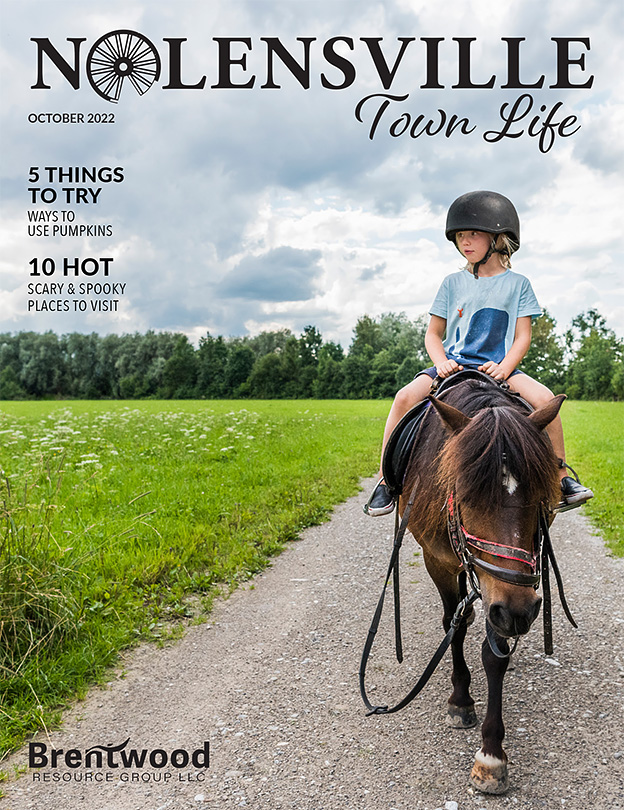
I designed this masthead for a new publication called Nolensville Town Life. It will be a lifestyle magazine authored by the Brentwood Resource Group LLC, based in Tennessee. This project required some research on the town and surrounding areas of Nolensville. I fully enjoyed learning about its history and the way of life in this Nashville suburb.
The founding of the town goes back to the story of William Nolen, an early pioneer traveling west of the Appalachian Mountains. According to legend, he and his family were passing through the area in 1797 when their wagon wheel broke. He decided to settle there and the community was then named after him as Nolensville. To this day, the most popular graphic icon observed in the local media is the broken wagon wheel. I gladly introduced this symbol into some of my design concepts and it was received well by our client.
The classic font style implies a timeless sensibility and complements the illustrative wagon wheel. Overall the design speaks to a refined elegance, with the flowing script and engraved-like letter forms. This masthead is readable in different color variations, on a variety of backgrounds and can be utilized for all marketing collateral. Please see the accompanying website link for an example of this masthead in action.


