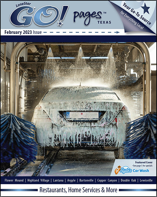
Front & Back Cover Design Revision
Click an image to open in slideshow view
At the Murray Media Group, I had the challenge of updating the design of the GO Pages Magazine. This includes three publications, each distributed to a separate region of the North West DFW area. These magazines are filled with advertising for local businesses and are one of the longest running publications of the agency.
I first elevated the style by refining the details of the large letter forms. The existing masthead was so bold and heavy, I removed the excessive outlining, added a gradient fill and a subtle drop shadow. This created more negative space and brought attention to the font. The front and back cover designs were laid out in different variations of one color, allowing the focal point to remain on the featured advertising content. Type hierarchy is consistent throughout, bringing order to the page to increase legibility.


